Tung
Visual Identity - 2016
Can you see?
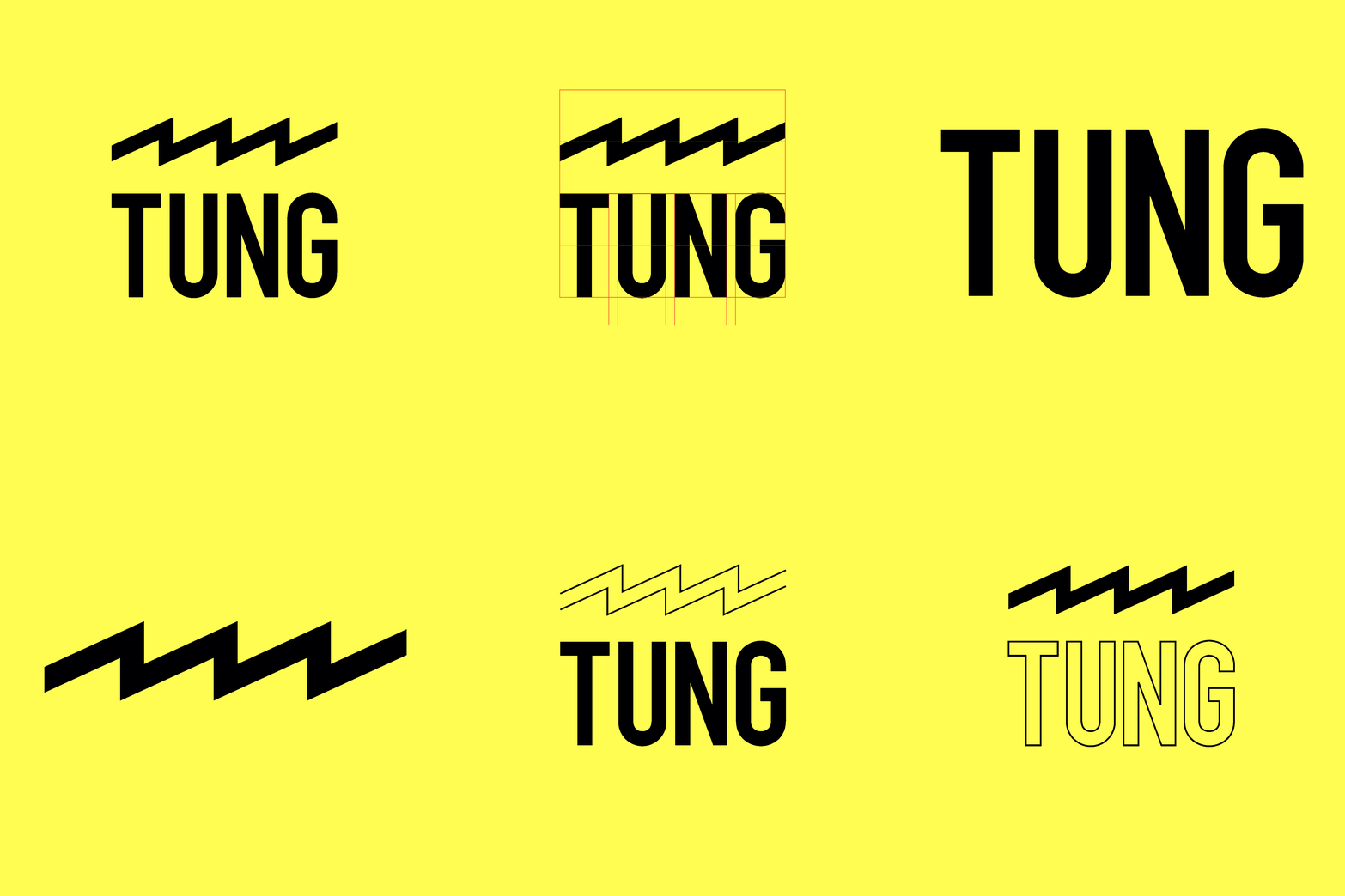
Tung is a casual clothing brand that distributes T-shirts and accessories online. The light comes flashing fast and allows us to see in the night. The Tung brand aims to tell stories with each of its items, to illuminate intuitions, or even to express complex ideas with its thought-provoking collection. For this reason, the logo is a tungsten filament (the name Tung is an abbreviation), of those that blaze in the centre of an incandescent light bulb, a symbol of the idea of par excellence. At the same time its zigzagging profile represents a factory, a forge of bright thoughts. After designing the logo and the guidelines for the coordinated image, we collaborated in the designing of the concept of the collections and in the production of the subjects printed on the shirts.
Keep discovering on the Tung website


Prometheus’ Firemen Brothers.
The first collection, called Prometheus’ Firemen Brothers is based on the myth of Prometheus. He had ten brothers, the Titans, precisely five pairs of twins, who wanted to save the rebellious brother from the wrath of the Gods, diverting him from his intent to bring fire to mankind. Hence the idea that the Titans were firefighters, and Prometheus, frail and young compared to his brothers, was dressed to run faster with his pocket lighter.


Masks Collection.
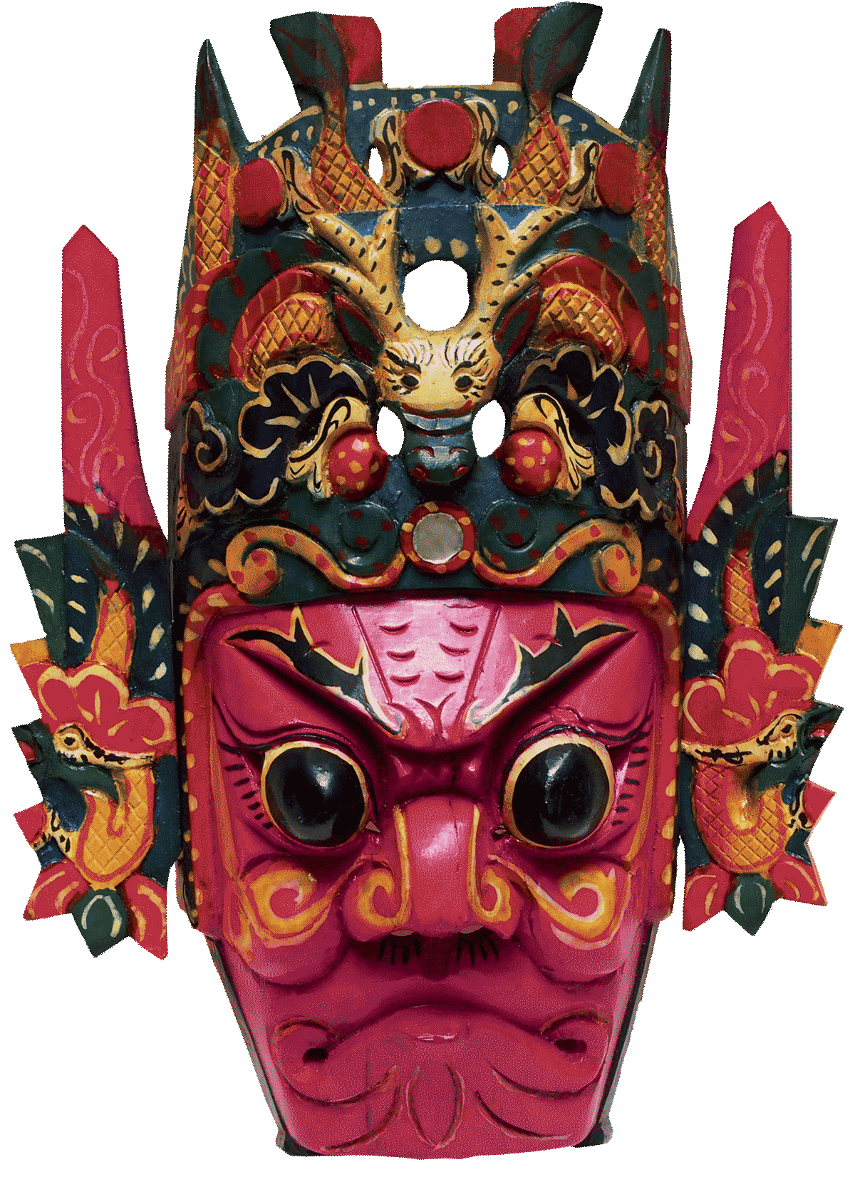
This collection reveals the origins, meanings and traditions of each item, linked to a particular mask that expresses a remote culture in time or space. From China to the ancient kingdom of Mali, from Japan to the Incas, to the Pacific islands.
In each T-shirt the mask is accompanied by a real printed caption that informs about the meaning of the image. By studying the sequence of actions that the buyer performs when he receives the product by courier, the packaging and communication artefacts have been designed so that that experience becomes a moment of cultural enrichment and invitation to share.


