Atelier Keaton
Brand Identity - 2021
A package of meanings.
Atelier Keaton was born with the mission of producing high quality furnishing for home relaxation and selling it online. The name refers to the street where the production workshop of the Arconas group, of which Atelier Keaton is a new branch, is located.
Its icon represents its two goals in one image: a package, referring to the shipping after the online purchase is, at the same time, a map of the Keaton crescent and its cross streets. Finally, it also represents a stylization of the initials AK. The logogram has a relationship of proportion with the icon based on the thickness of the lines and lettering.

The rules of the game.
One of the most exciting activities concerning the birth of a brand is the creation of a visual language whose rules do not limit the complexity of the message and allow you to tell many stories. As in a construction set, basic elements are given and possible combinations illustrated. Even the rules have their own degree of expressiveness: in this case the safety of a perfect manufacture, the calmness, the attention to the quality of life inspired by the sobriety of oriental cultures.
Keep discovering on the Atelier Keaton website

A clear and solid vision.
Ideas are shaped layer after layer. A simple initial principle is continuously enhanced by the dialogue with clients. The purpose of our brand identity design work is to foster this growth until the idea appears as clear and solid as a mountain.
In fact, it is a question of making the idea visible, or rather, of making sure that everything that can be perceived through the senses communicates that initial principle, hence called vision.
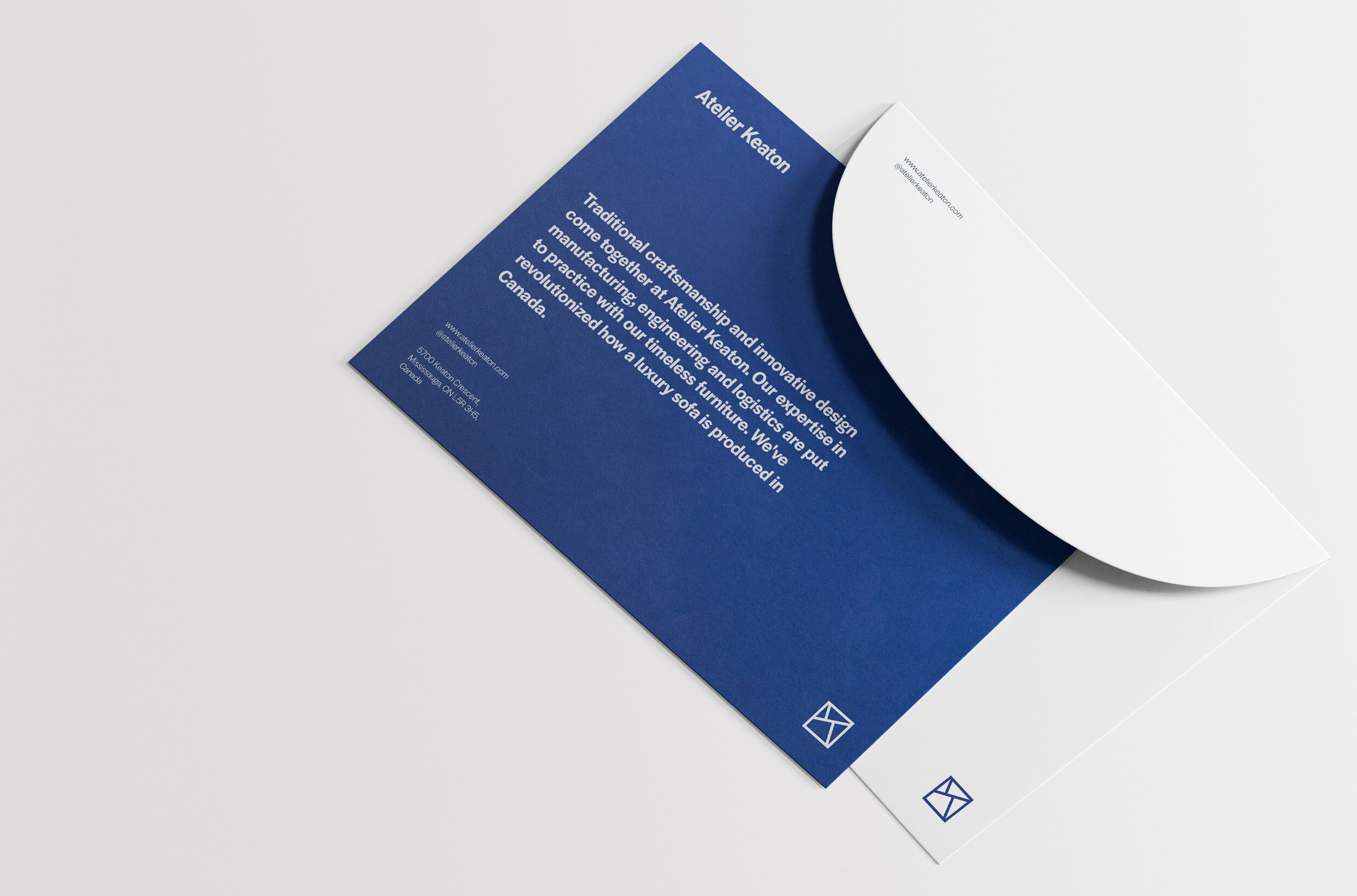
From that vision, then colors, shapes, lettering, graphic proportions come naturally and gradually develop in complex artifacts, deriving from the combination of the previous ones. This is how we designed the packaging, the promotional images, the website, the videos and all materials for Atelier Keaton.


Sofabulous!
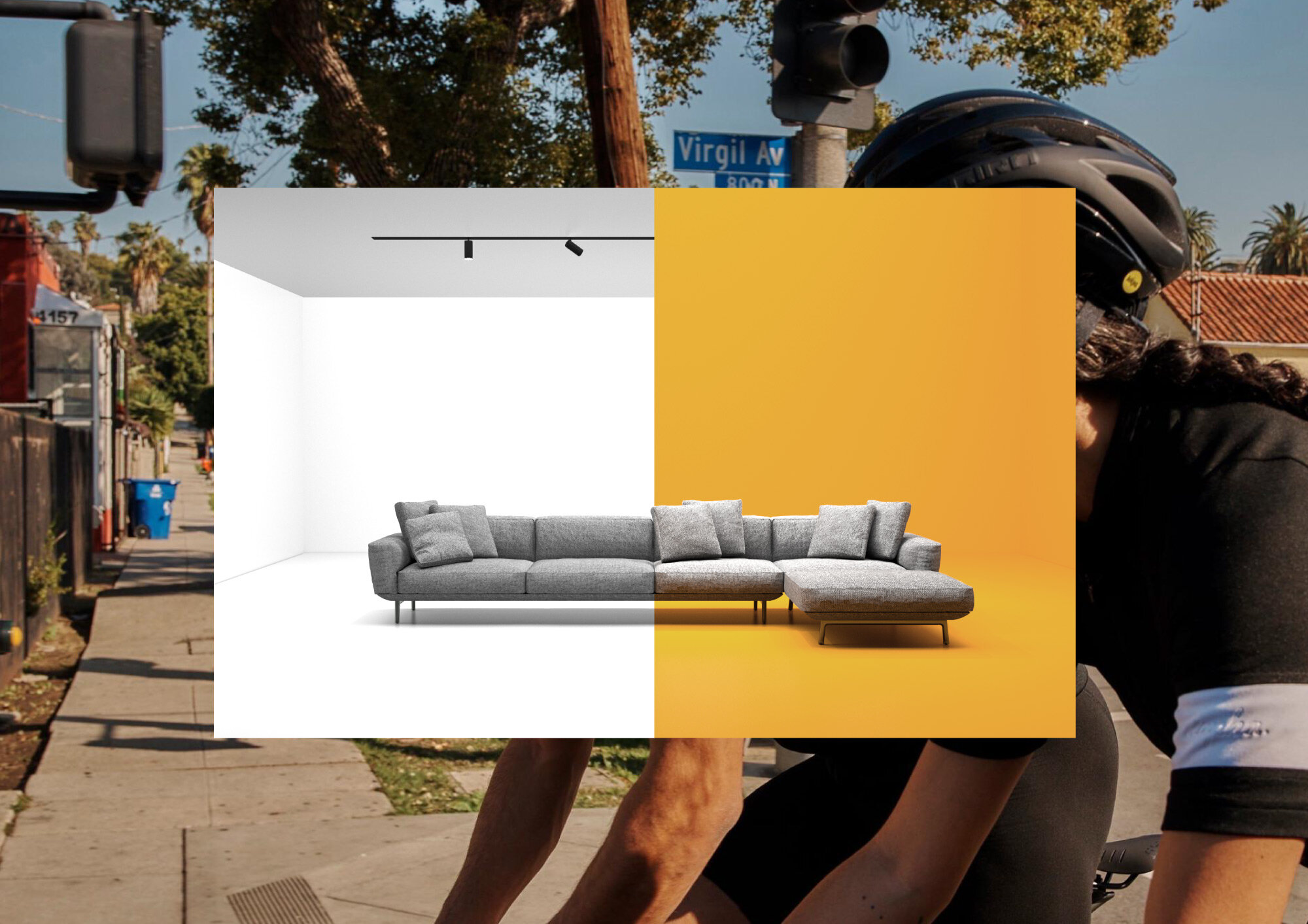
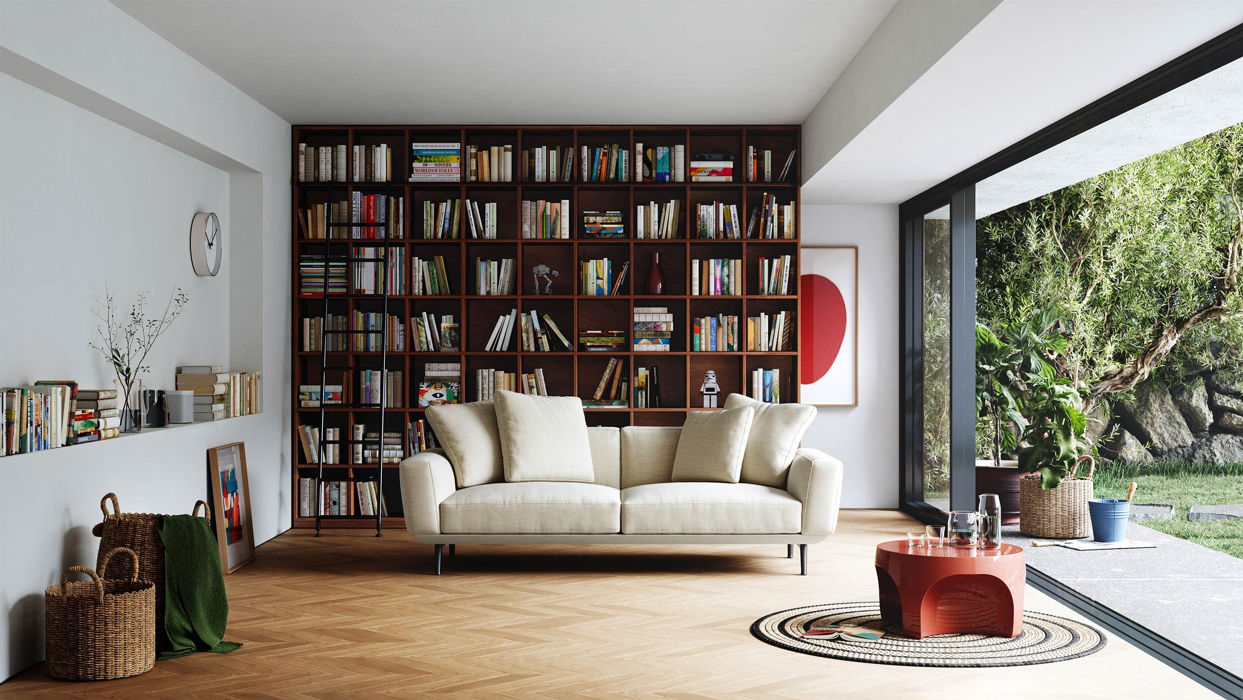
The first product with which Atelier Keaton introduces itself is the Amelia sofa, designed by our studio: every detail of it expresses the brand identity. The story of the product is told through renderings and videos that we have designed consistently with the vision. The still lives of all configurations are functional to the choice of the product on the website.
We have designed domestic settings to place the product in to create images that convey the intangible values of the brand vision and respect its color palette. In the website design we have combined these visual ingredients to launch the product and consequently the brand in the simplest and clearest possible way.


